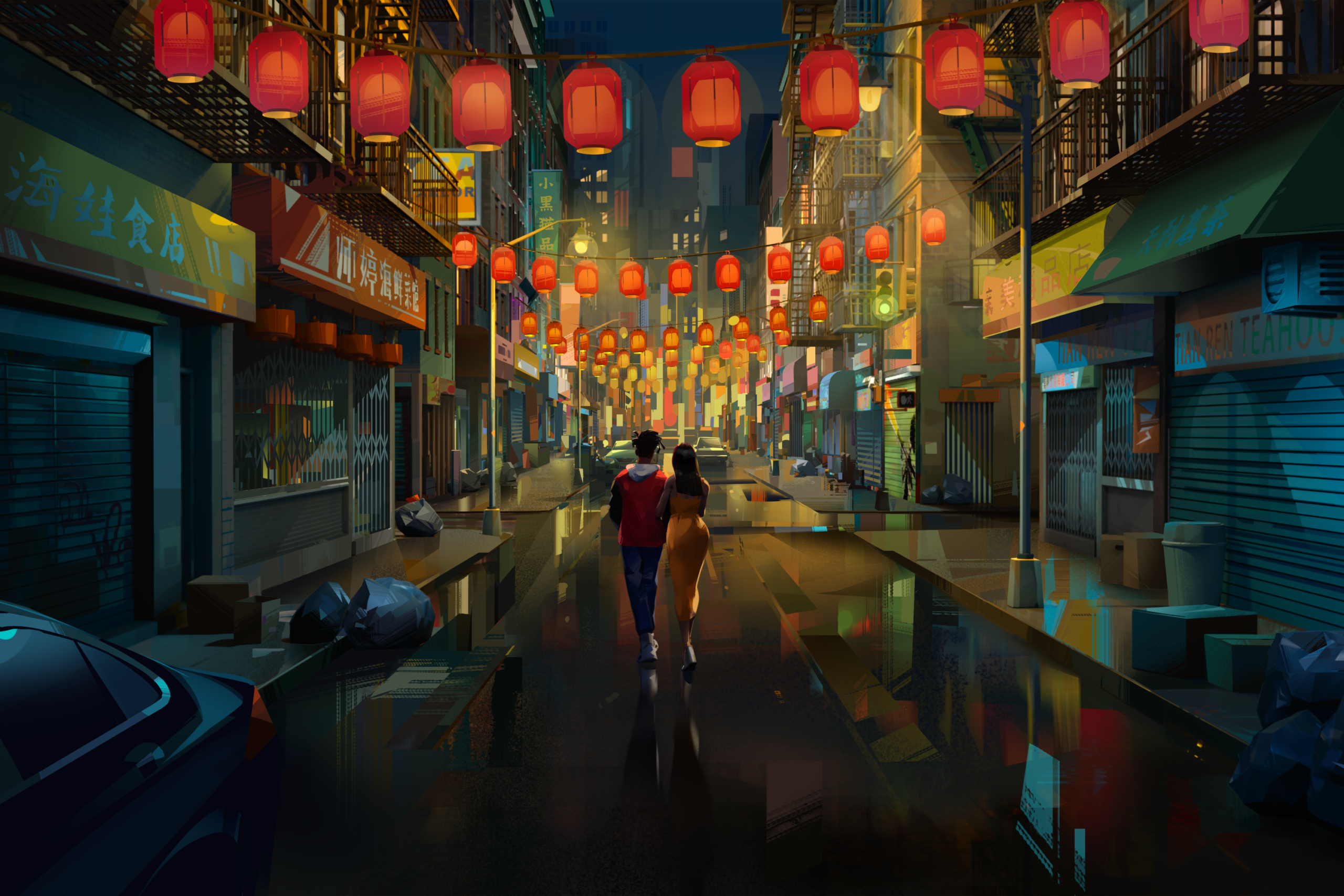
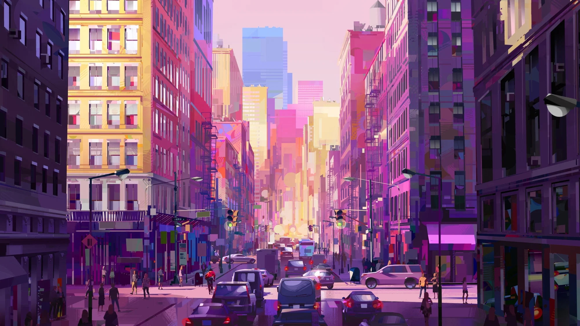
Entergalactic, Netflix’s animated Emmy hopeful created by singer/rapper Scott “Kid Cudi” Mescudi and Kenya Barris, marks another “Spider-Verse”-influenced breakthrough that stretches the bounds of illustrative 2D to 3D stylization. The aesthetic presents New York City as moving concept art for a modern love story about two artists, Jabari (voiced by Mescudi) and Meadow (voiced by Jessica Williams), presented as a series in five chapters.
Production designer Robh Ruppel (who provided visual development for “Into the Spider-Verse”) did the illustrative world-building in collaboration with director Fletcher Moules and London-based animation studio DNEG, which rewrote its pipeline to translate the concept art into a handmade look. This spanned animation, shading, lighting, compositing, and rendering. (DNEG leveraged many of these new tools and techniques while simultaneously working on Netflix’s animated feature, Nimona.)
“The free-flowing style fit the idea about an artist in New York,” Ruppel told IndieWire. “So we wanted to portray the world in an artistic fashion that helps illustrate the story.” Creating the concept art conveys the aesthetic through composition, color, and light, but the hand of the artist often gets lost in the translation to animation.
“Our goal was to keep where we started from and to kind of throw away what CG had perfected for the past 20 years,” added Ruppel. “We got rid of the bump map and surface detail; we got rid of subsurface scattering and occlusion and what CG has done so well. What we needed was really good color maps that have brushwork and where the form is painted into the color map itself.”
At the same time, they needed to create lighting to complement the nice painted textures so you can see all of the surfaces. How did they accomplish that? With fake reflection using the geometry to make it look like a painting. “Everything was represented with a brush stroke and we had very hard shadows and everything was a graphic mark rather than a line,” he said. “It was a graphic style that was simplified but accurate, a truthful version of reality.”
Background buildings, while having the correct perspective, serve as more of a graphic representation of a very detailed New York City landscape than a photoreal recreation. “It’s just appropriately sized colored squares for windows,” said Ruppel. “But it’s the values and the tones that make it look believable, that carry the illusion.”
Meanwhile, color played a large role in telling Jabari’s story to emphasize happiness, sadness, or regret. “We had four looks,” Ruppel continued. “We had the basic New York look, then we had the Mr. Rager look [of his comic character], which is black-and-white and red, and then we had two flashbacks: One that was in the anime style, and one that was a very funky style.”
As far as interior design, there were Jabari’s and Meadows’ adjoining apartments, which reflect their personalities. “They’re kind of mirrors to each other, so it’s a similar layout,” Ruppel said. “The idea is that it’s an aspirational loft and we wanted to put it in the reach of people’s imaginations. Jabari is barely moved in. He’s got a couple pieces of his artwork, his bicycle, lots of boxes.
“And then Meadows is the exact opposite. She’s been there a lot longer. There are the books and the records and the carpets and the plants and all the hanging light fixtures. It definitely represents her workspace.”
Then there were the surreal fantasy sequences with Jabari and Meadows in space, which were the hardest part to execute in layout. “When you’re traveling through the infinity of space, there’s no depth cues,” said Ruppel. “How do we feel like we’re moving?
“And so we would do some 2D pieces of artwork and we’d pan over here, z move there,” he continued. “But then we had to figure out ways to enhance that with dust motes even though they’re not dust motes going by the trail coming off the bike. That gave a good sort of z-depth cue, a little bit of subtle parallax with the galaxies when they would go away from it, pulling back on the stars, having stars go past. The trick was getting the timing to work in layout so that you felt like you were moving.”
This piece was originally published by IndieWire and was written by Bill Desowitz.